Challenges are going crazy on social media: challenges between artists or, the ones I prefer, challenges with oneself. More than challenges they are perhaps projects, which have a clear intent from the beginning and whose outcome is not necessarily a foregone conclusion, and usually also difficult to achieve.
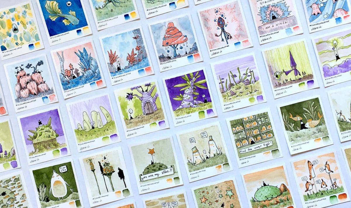
In 2021, I also decided to do a challenge to challenge myself-I called it "The Two-Color Challenge," and it consists of creating 100 colored drawings with only two colors.
The origin of the challenge
It all started from the fact that I noticed a weakness in my drawings: the use of colors. I find that I use colors totally haphazardly, without paying particular attention to the overall composition of the picture, to having a predominance and accent colors, to generally having a balance.
When I look at other artists' illustrations I am often enraptured by this ability to handle colors, and to use them masterfully to direct the viewer's attention.
In my drawings the colors are random: one for the background, one for the trees, one for the characters, others for the details--a harlequin without any meaning.
The goals of the two-color challenge
In my two-color challenge I had clear goals in mind that I wanted to achieve, or rather skills that I wanted to train:
- thinking before drawing: having only two colors, I am forced to think before coloring. Which of the two colors will be the subject? Which one will be the background color?
- mixing the two primary colors in search of the secondary colors: I am not limited to having only the two colors I have assigned to myself, but I also have all the shade I get by mixing them together.
- completing a project with 100 drawings: making the drawings small is definitely a technique to facilitate the success of the project... however, it is not at all obvious!!! 100 drawings is really a lot, so the challenge becomes intriguing.
The two-color challenge: make 100 drawings by coloring them with only two colors
To make the challenge less boring, I decided to divide the 100 drawings into 10 sets of 10 drawings, each colored with a different color pair. The choice was purely so I wouldn't get bored with using the same two over and over again, and it was successful because I think I learned more: I learned how to mix pairs of colors that I might otherwise never have mixed.
1-10: yellow and blue
I started immediately with two primary colors, thinking it might be easier. It is clear from color theory that the color between yellow and blue is green. I could then get different shades of green, from cooler ones tending toward blue, to lighter and brighter ones toward yellow.
11-20: blue and red
Still following the idea of primary colors, I thought I would keep the blue and mix it with the other primary color, which is red. The resulting color should be purple. Here the first problem arose: the colors I had chosen were not exactly the primary colors, so the resulting was not exactly purple, but more of a gray-like coloring. Very difficult to dose! In fact in the first colors I used blue and red diluted with water to get lighter shades, but without mixing them. But then I decided to combine them, and to face this challenge seriously and without looking for shortcuts.
21-30: purple and green
At this point I introduced a new personal rule: with each change of color pair, I would keep one color from the previous pair. I don't know why I decided to do this-perhaps to add a difficulty: I had just learned to use that color along with another, what would happen if I changed the pair? Another reason was to make the transition between pairs more pleasant by posting the designs on social media.
31-40: olive green and gold
Not satisfied, I wanted to raise the bar further: what if one of the two colors is a metallic color? Can it be mixed with another to get a third color? THE answer is easily seen in the drawings I made: no, you cannot get a third color. So I had to play on the shade of green, and let the gold play as an accent point. Although the result is strange compared to the other drawings, I don't mind at all: in fact, from here I decided to introduce in all my drawings some touch with the metallic color, an accent here and there.
41-50: green and sienna
To get halfway through the challenge I went back to the "normal" colors, or let's say I abandoned the metallic ones. However, I pushed myself toward those colors that I had never used but that make a certain "real artist" impression: what color is sienna? I found it to be a beautiful shade between orange and brown, really nice to use and great to mix with other colors.
51-60: sienna and turquoisee
I liked the sienna so much that I decided to mix it with turquoise as well. The result? My absolute favorite pair of colors, which I still use often in my drawings. The contrast of the colors is wonderful, and mixed together you can get browns or greens. Truly an amazing and versatile pair!
61-70: turquoise and purple
This pair of colors was also striking: mixed together they formed a beautiful blue, quite deep, and pleasant gradations of warmer and other cooler shades of purple.
71-80: purple and yellow
Purple and yellow are two secondary colors, and combined together they created a series of brown shades for me. Having a third color so different from the two parents is especially helpful and definitely makes things easier.
81-90: yellow and red
After two secondaries, I went back to mixing two primaries, which is the pair I was missing: yellow and red. Knowing that orange would form, it was quite predictable to handle them. However, the resulting designs are obviously very warm and bright, at the antipodes to the purple-turquoise pair.
91-100: metallic red and turquoise
Finally I go back to complicate my life, choosing a very dark metallic red and turquoise. In person the result is not bad, but it is virtually impossible to photograph it: the metallic red is really too dark and it is very difficult to show it in photographs.
Conclusion of the challenge of 100 drawings
First, I said to myself, "Well done!" Yes, because I was able to complete the challenge. I created 100 drawings and colored them with only two colors at a time. Getting to the end and seeing all the drawings together is extremely satisfying, and moreover I feel that even the ugliest drawings are great in the series: if taken individually I would not have liked them and would probably have been disappointed to have drawn them, seeing them together with the others, forming a series of 100 drawings, gives them a special charm.
Did I learn to think about the colors and the final composition before using and mixing them? I think so, although I can't say I have finished learning. I don't think it's a particular skill of mine, so I will have to keep practicing and perfecting it. However, I have definitely improved with this project, so I am satisfied.
Have I learned how to mix two colors to make a third? Again, I would definitely say yes! I discovered color pairs that I am passionate about and that I use even more willingly today, because I know how to process and enhance them. I discovered sienna, which seemed to me to be a color for "real artists" (a bit to be cool, let's say... ) and instead I discovered it to be an extremely versatile, useful, pleasant color to use. I also learned to appreciate metallic colors, to add preciousness or brightness to certain elements.
What is your favorite pair of colors? Or is there one design that you just liked more than the others? Let me know in the comments!!!
If you decide to do the two-color challenge instead, tag me on social! I would love to see your results!
Comments